WSIB Passport
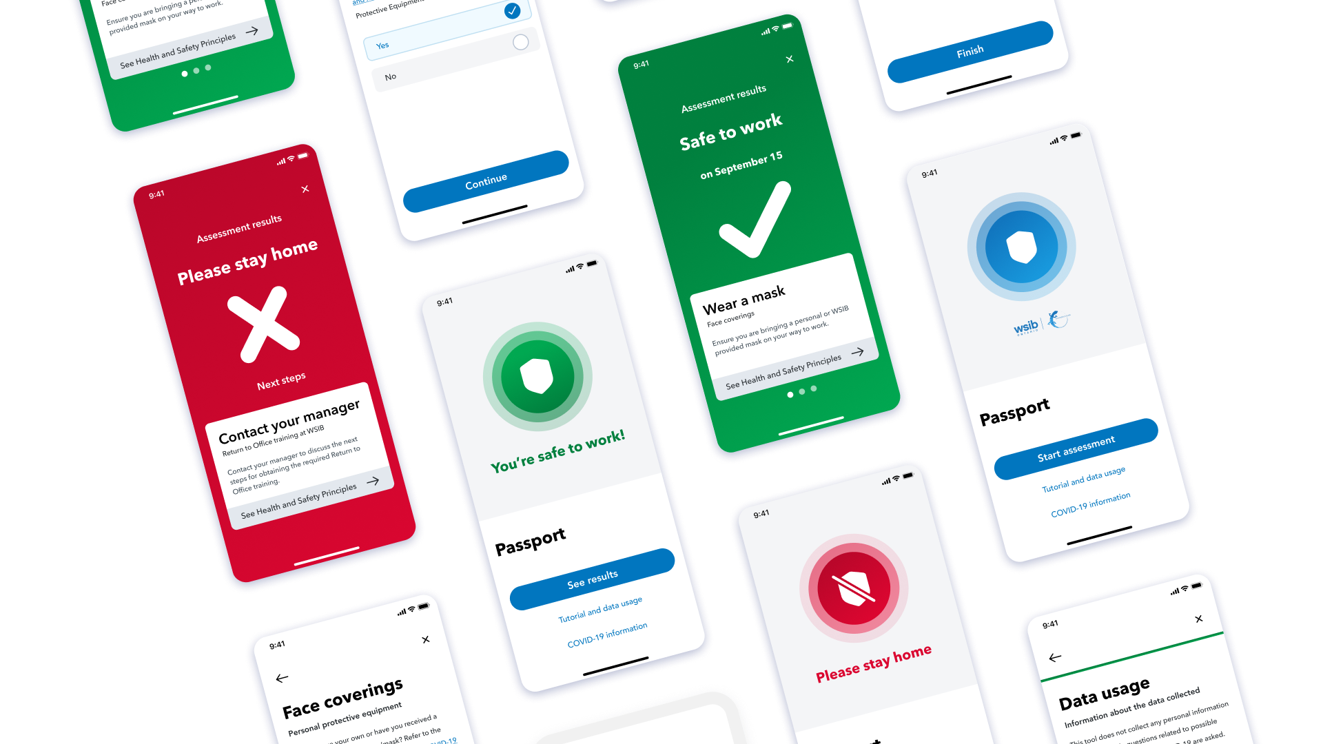
Media support for this case study is only available on Desktop. Mobile support is coming soon.
Role: Product Designer
Team: Design & Stakeholder Manager, 2 UX Designers (I worked with the fabulous Amanda Guo - check her out!), 4 Developers
Time: 4 months
Skills: UX Research, UX/Visual/Brand Design, IxD, User Testing
Tools: Figma, Maze, Google Forms
Problem
As offices at the WSIB began to open again in the middle of the COVID-19 pandemic, the WSIB
had no efficienty and safe way to screen employees returning to COVID-19 for risk
factors.
Outcome
The solution I built in collaboration with my fellow designer and developers screens
WSIB employees in under a minute, auditable almost instantly from a safe distance of
over 6+ feet away.
Users were wary of data privacy amidst logistical and safety concerns associated with returning to office
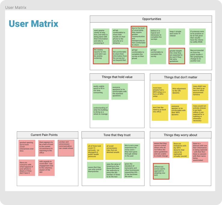
Using preliminary knowledge and researchs, I made assumptions along with my co-designer. We assumed that due to the demographics of WSIB employees who would be using our solution, users would be less tech savvy and more weary of data privacy. We learned that while anonymity was important, tech savviness was very high!
Understanding WSIB employees and their needs to design the smoothest screening process possible
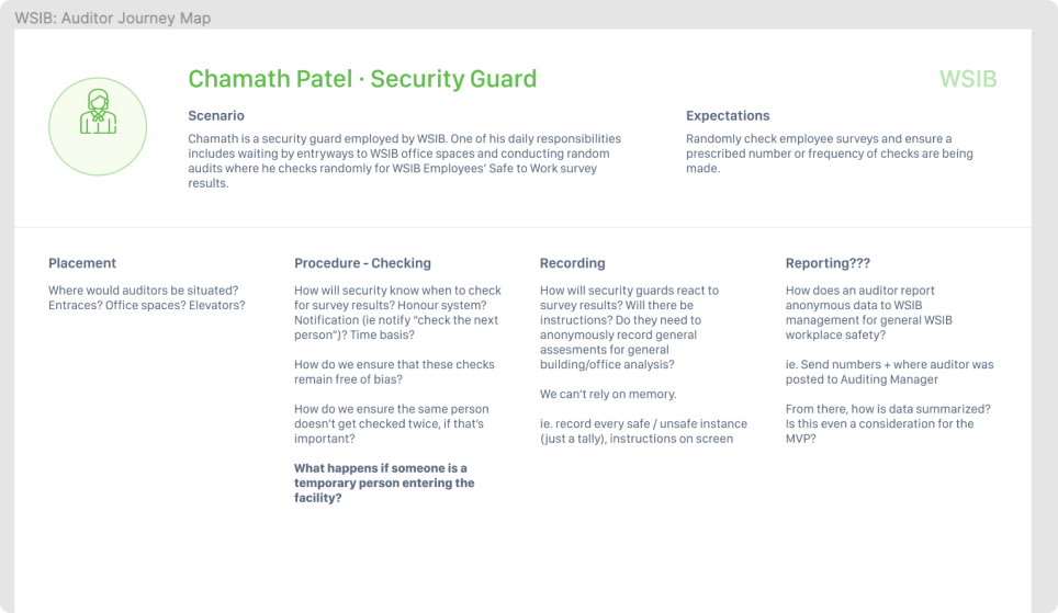
Conducting user interviews also allowed me to create a user map so that I could ensure I was designing the best experience for a secondary user - the auditor.
Prioritizing rapidity and anonymity for a COVID-19 self assessment
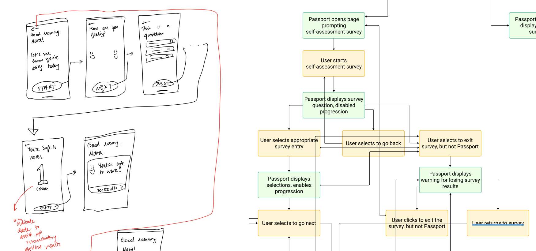
At this point, the WSIB operations staff had passed on a self assessment we were to conduct with our solution. That took care of safety, but these sketches helped me analyse what designs and flows would ensure a quick assessment time as well as anonymity.
Mid-Fidelity Screens
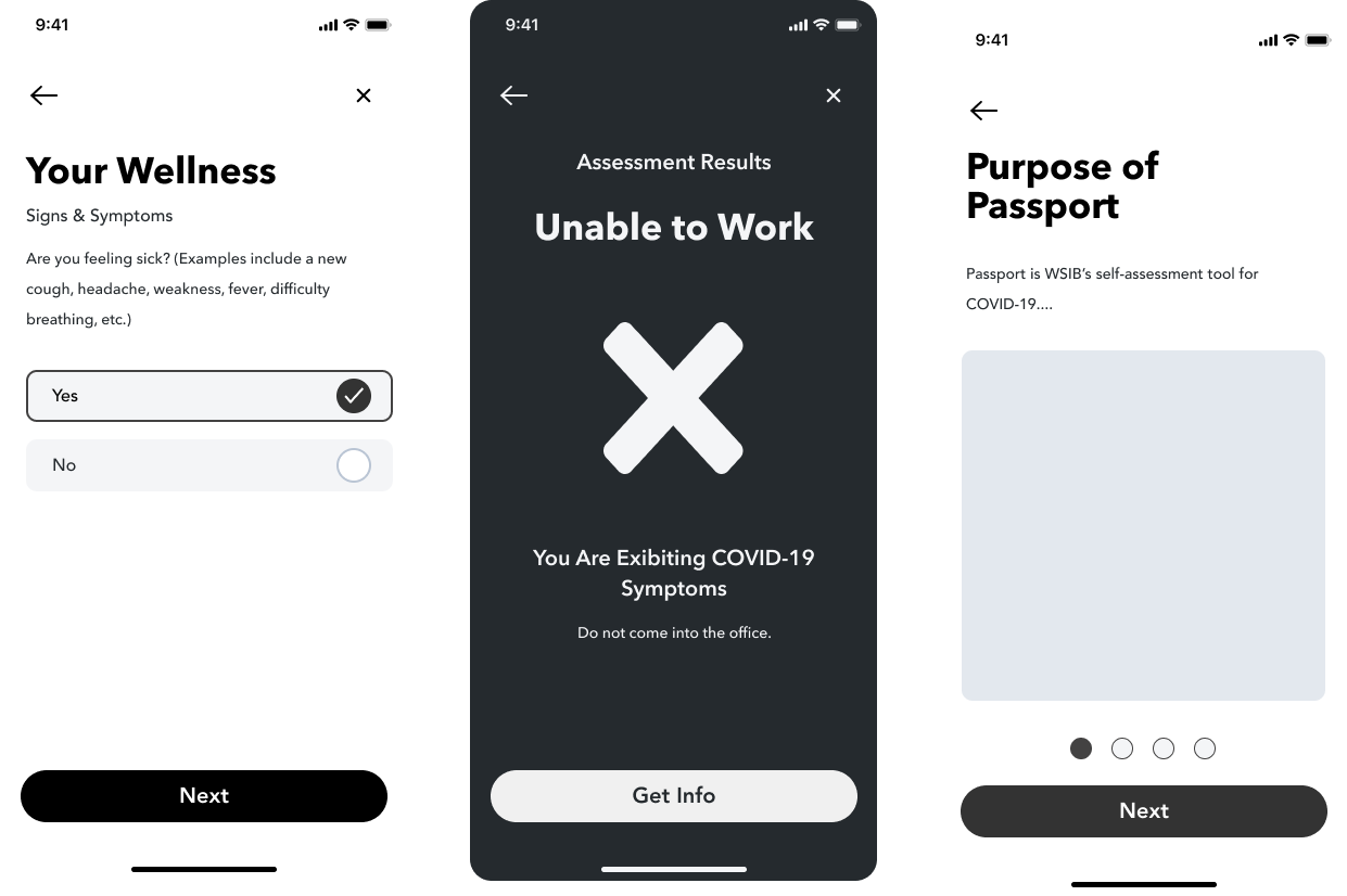
Following initial sketches, and wireframes, I designed mid-fidelity screens. I designed these to centre my initial designs around contrast, type, size, and layout for accessibility. I also handed off these screens to the developers so they could begin creating components in their code that they could apply the design system to later.
Onboarding users quickly and pleasantly
Although we found that the users we interviewed picked up on new tech pretty quickly, we wanted to ensure we communicated every aspect of the app quickly and clearly to cover all potential gaps in knowledge. 90%+ users breezed through the tutorial with no problems and learned why they were using the app and that the app did not store any data.
Quickly screening WSIB empployees for COVID-19 risk and their ability to go to office
The quick to finish assessement was designed so the assessment finished as quickly as possible. The longest version of the assessment took less than one minute to finish, and with the large iconography of the results screens, was instantly auditable. Cards informed employees of next steps for extra communication.
Validating that our users had a pleasant experience, and measuring OKR's

I designed a Maze User Test which measured the important metrics of success, including time spent, security, and and overall usability. All of our scores indicated that we achieved our goal of making a solution that was trusted and quick to use.
Iterations
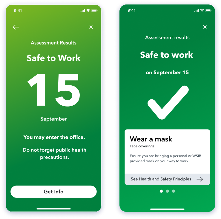
I didn't design my screens in one go! Through several collaborative iterations I was able to iterate to a better solutions. These changes, from changing design system colours to adhere to AAA accessibility standards, to introducing a carousel which gives easier access to information, and making results more easily identifiable from 6 feet away, greatly improved the solution.
What I've learned
I learned that a lot of times, building trust in a product doesn't require really fancy gadgets, but just empathy. I learned to understand that when people are concerned for their privacy, that does not mean they may not want to participate, but that they need to trust what they are participating in. I also learned how to truly collaborate in a fast-paced environment, working with another designer, to project stakeholders, managers, and devs - it really takes a village to build a successful product.